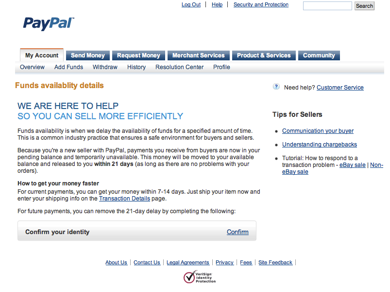
Turns out people don't like anyone messing with their money.
I worked with some really smart folks in the Risk org at PayPal, but their central focus was not the user experience, it was losses. Their performance hinged on limiting the shrinkage, so sometimes they didn't think through how this affected the end user. They'd slap holds on people's funds, for a variety of risk factors, and people would go apoplectic.
My team helped improve the UX, from better messaging to removing unnecessary steps that weren't relevant to nearly all users.
The visual design here is dated, but that was the PayPal style of the day. : )
My team convinced the Risk group to drop these "selling" goals because data showed they weren't relevant for most people stuck in holds.
We improved the identity experience by allowing the user to add a new phone number and do the whole thing through SMS if they wanted.


