Introduction
The Internet is awash with blogs about design principles, techniques, styles, and interactions. But not so much about UX leadership. I don't think it's appreciated, and maybe a bit harder to define. Tech, generally speaking, frowns on managers, seeing them as can't doers who bring more talk than talent. There is some truth in every saying, but I think dismissing the role fulfills the prophesy — you won't get quality leadership if you don't see its value.
UX leaders need time to grow, and the skill set can be very different from what's required for individual contributors.
The valley doesn't always see that, often cannibalizing great design talent to fill manager roles. This can lead to a creative vacuum and uncertain leadership. Sometimes it's the right move, sometimes not, but without appropriate attention to the art of design management, the same issues will crop up over and over. The purpose of this site is to share my philosophies, and see what they spark. You can't expect much more than that.
The content will evolve and change over time, just like me. I don't pretend to have all the answers, just some reasonably well-formed ideas. I hope you agree.
BE THE TRUTH
Transparency is a buzzword.
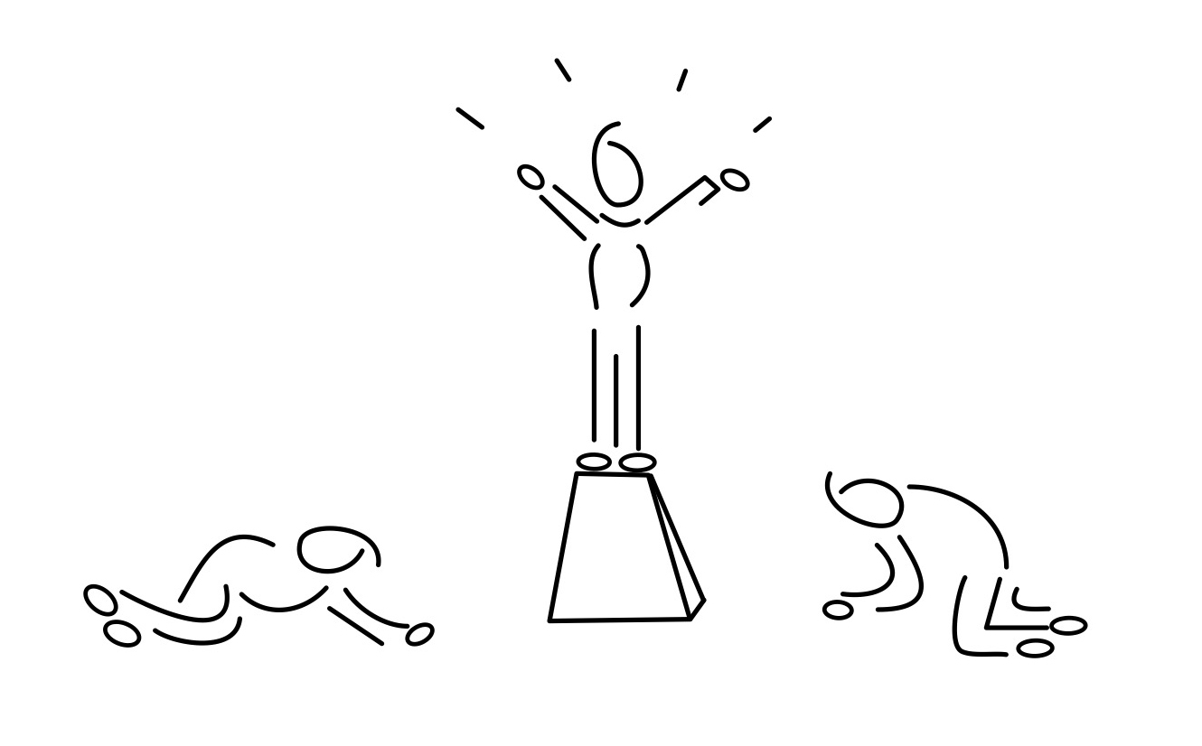
I'm fully aware the caption might seem hokey, but it's the most direct and appropriate way to word this.
Many times I've listened to leaders lie to their employees, saying one thing while something quite different is being done behind the scenes. Be wary if you hear your boss talk about "transparency," because it's often an illusion, much like open floor plans and full glass conference rooms. Being the truth means you don't BS your team about layoffs or politics, and your actions are never contrary to your words. To build real trust, you have to ditch standard corporate practice, like overhyping scut work or minimizing big problems.
GET TO A PLACE WHERE YOUR TEAM WILL SHARE EVERYTHING WITHOUT FEAR.
I've had ongoing conversations with a few people on my team about interviewing elsewhere, and I'm proud to say I'd give them the day off to do it. Counter offers can buy you a little time, but it doesn't fix their issues. You have to openly talk about the challenges on the job, and put your neck out to address them. Your team will know whether you're doing that or not.
Even if the company is crumbling around you — Bad PMs with no requirements, serial leadership changes, rogue development — you can still maintain positivity in your group by focusing on what they do, and how they do it. Launching a good usable product is always the goal, but if there are barriers, like poor implementation, the design work can still be celebrated on its own merits. This is a temporary fix, and as a design leader you have to work to solve issues outside the discipline, but sometimes the best you can do is isolate what is good about the design work, and make that a source of pride.
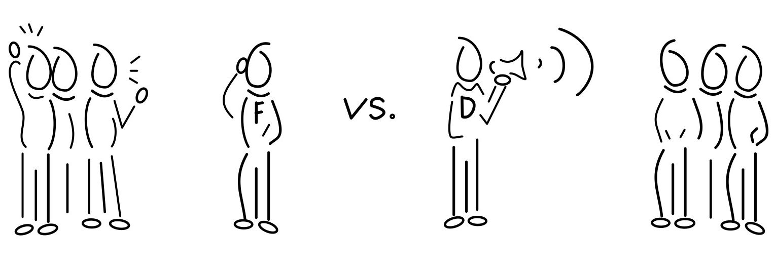
FACILLITATOR VS. DICTATOR
Your head is small.
Today's products need to be designed and delivered with record speed. There was a time when companies would do seven rounds of usability on each continent before rolling out their offerings. That's great for sponging fakers who love 5 star hotels in Singapore, but not for staying competitive with start-ups and focused businesses who aren't playing around.
Moving fast means making decisions fast, and that can lead to the "dictator" design model.
Every tech company has someone who fancies himself the next Steve Jobs, and that guy is more than willing to command a team of pixel pushers. They'll dutifully produce 5 versions of each screen, Mr. Decider selects a favorite, and this continues until the product is launched.
It can work. But there are significant flaws.
It's unlikely the product will be at its best, because one man's head is small; he just doesn't know everything. Secondly, and this is really important in the long term, the designers will resent him, and eventually leave. More than likely, a dictator is climbing the ladder, and the creative talent will see their work is only a small part of his empire building. Designers live to create, and cranking out mock-ups is not creating, it's production work. There is a place for that, we all have to do it at times, but it can't define the job.
A facilitator, in contrast, is about creating an environment where ideas win out, not personal opinions. In this model, the leader doesn't impose her will; she establishes a culture that focuses relentlessly on finding the right solution. She's always listening, connecting thoughts and disciplines, and bringing teams together. Sometimes she inserts her opinion, but it's delivered and weighted just the same as anyone else's. If you create this culture, there will be rare instances when you have to override a decision, and if you've built up trust, nobody will take it like a command from up high.
A facilitator leverages the talents of her team, taking the time to figure who is good at what, and what is good for each person. Pair up complimentary designers, and don't buy into the unicorn myth (even if a designer is strong at visuals and UX, he is still just one person, who will produce better work collaborating and sharing with other UX professionals, not going it alone).
DESIGN BY BEST IDEA
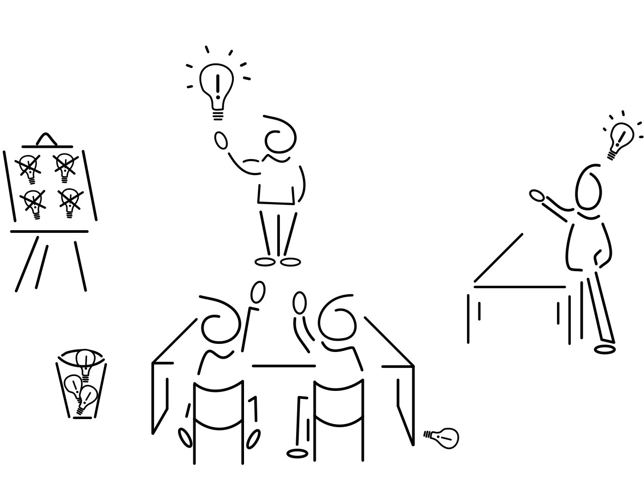
Committees tend to mess things up.
It can be difficult to get the right balance between work culture and work process. I worked at a company where the culture was very friendly, but in many ways too nice. Toes were well protected, and this leaked into the work process. Here's an example from when I was a content strategist...
A designer put together a UX review with a range of team members and stakeholders, with the goal of dialing in a flow. The review, as one would expect, included feedback and suggestions on what could be changed or improved. I gave my opinion, not realizing that the designer felt this was unwarranted and maybe back-stabbing. UX should never criticize UX was an informal motto of the time. A series of 1:1s ensued, with functional managers coming in to analyze and massage feelings, thinking this was the right solution to what appeared like a disagreement. It's how the company worked.
But the culture was wrong.
My feedback was respectful, and never focused on the person; it was the ideas that I challenged. But at this company, during this particular time and space, the ideas and the person were inseparable, because designers thought their designs were an extension of themselves. They felt as if every pixel was theirs to define.
It's a fairly common issue with designers who have not worked collaboratively, because they’ve grown accustomed to being the one stop shop. There are also those who are more visual design than product design… i.e. they are crafting something that is coming out of them, not something evolving from customer insights, team collaboration, etc. That can be dealt with on an individual level, but if the culture generally supports the notion of harmonious compromise, then you've got a much bigger problem.
If you have a culture of nice, you likely have design by committee.
In order to make everyone happy, everyone gets to add something to the product. Fred thinks settings should be in a modal window, but Joan believes a wizard would be useful. Now you've got a Frankenstein flow that makes no one happy, particularly the customer. The problem is not that each person contributed an idea, it's that they weren't rigorously challenged before being agreed upon.
Design by best idea focuses on — yup — ideas, and this means they can come from anywhere. Many organizations cede total ownership of certain aspects of a product to those trained in that area. Visual designers own the icons and logos, UX designers have the wireframes, and writers the words, etc. But this wraps the decision-making up in one person, who then owns one aspect of the product. An idea-focused team is different. A writer could have a good thought on interactions, while the visual designer might suggest alternative messaging. If they're good ideas, they're good ideas.
Now you might be saying, ideas are great, but customers are the ultimate arbiters of the user experience. That is true, but the practical world has three realities that we all face on a day to day basis.
One, what you put in front of usability participants is just as important as how they interact with it. The designs can be informed by research and analysis, but you will need to depend on the talents of your designers to sculpt the initial pass.
Two, usability results still need to be interpreted by UX professionals, and even with extensive iterative design, decisions will need to be made that aren't explicitly illuminated by the testing.
And three, it's rare to have the budget or time to test everything that goes out the door, so you'll serve up some experiences that were only internally reviewed.
We do weekly UX reviews with the entire team, where every designer shares progress, and we discuss as a group. This harvests ideas and observations from UX people who aren't too immersed in the product. Designs get deeper, and more critical attention, in smaller working sessions. A design manager floats between the projects, connecting common themes and challenges. This furthers the cross-pollination, and runs ideas through a tighter mill. And of course, we do regular sessions with product managers, and checkpoints with engineering.
You still need a certain level of ownership taken by each designer, because ideas must quickly turn into stuff... flow diagrams, wireframes, mock-ups, and prototypes. The goal is to create a culture that rigorously challenges designs, yet heartily supports people.
FACE TIME & SPACE TIME
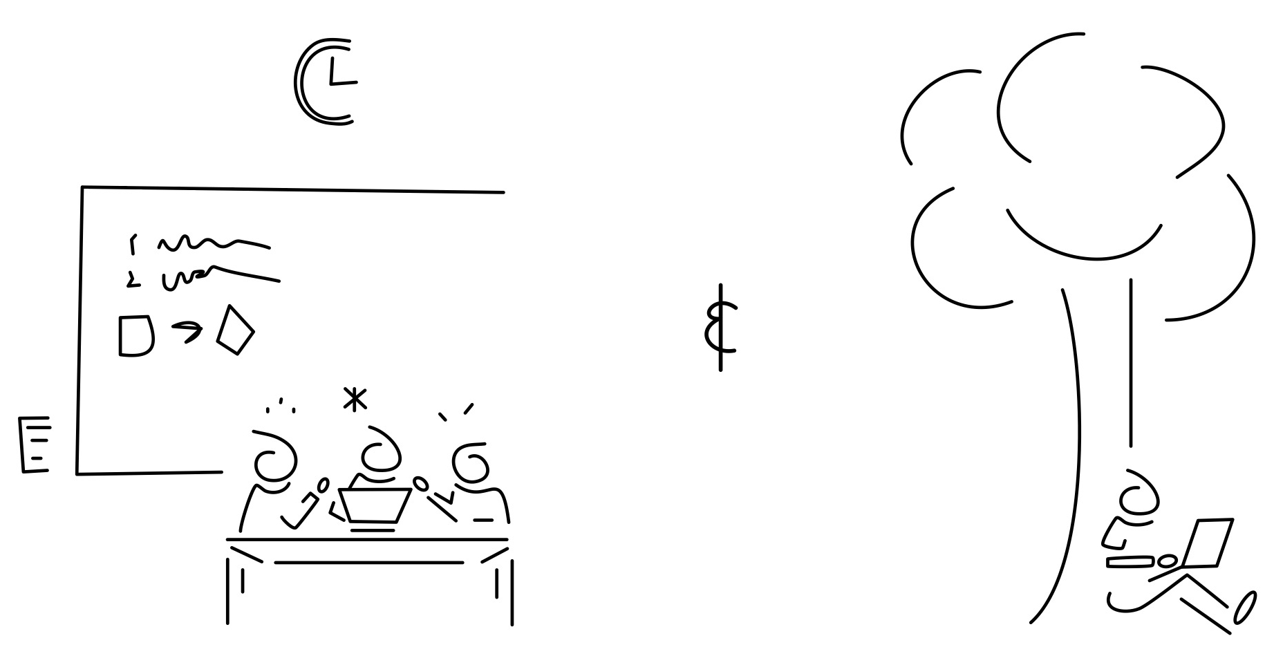
No man is an island. Well, sometimes.
Face to face collaboration is extremely valuable, but locking people in a war room all day leads to Lord of the Flies, with a descent into savagery you could never imagine. This can turn good collaboration into groupthink, where bad decisions are made because you don't have time to think through things on your own (it can actually reduce idea production).
On the other end of the spectrum, too much isolation leads to one track ideas and lost time.
Designers can narrow their focus too quickly, building out specs that become hard to reshape (a mental shift gets tougher with every hour of work and thought that a designer puts into it).
We encourage at least one WFH day a week, allowing the individual time needed to mull over ideas without the tribe up in your face. We do war rooms, but in one week stretches, with generally no more than four hour blocks at a time. And we don't sit in rooms together pecking away endlessly on junk; we have focused collaborative sessions where we attack a few specific items, and break when we hit stopping points.
FINDING THE ART IN APPLICATIONS
Where art thou.
Take any 10 UX professionals, and you'll likely find 4 musicians, 3 photographers, 2 painters, and 1 author. Or 4 authors, 3 sculptors, 2 wood craftsman, and 1 cinematographer. Or 4 stop motion animators, 3 pot glazers... okay, you get my point. UXers are creatives, with an inner need to — duh — create.
But our jobs are making products for customers, and while some consumer offerings are closer to art, most applications have a very practical purpose (particularly enterprise stuff). Seasoned designers recognize this reality, but it can still leave them wanting. Obviously some of this can be satisfied by going home and doing your woodblock printing or ice sculpture. But it shouldn't be completely missing from the workplace.
Finding the artistry in a work project can help keep your team motivated and happy.
There are two aspects of product development that naturally hinder creativity: style guides and product requirements. Fighting them for the sake of creativity is like arguing your house doesn't need walls; it just doesn't work. Generally speaking, the more a style is defined, the less creative space there is to work with. And we don't build things because we want them, we build them for the end user (ie. product requirements). Sometimes you need to challenge things in your style guide, and product requirements too, but rarely just for the sake of creativity.
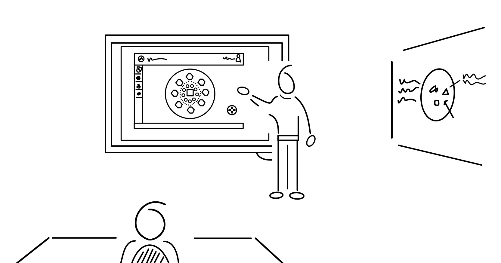
The drawing above is inspired by a real product we've worked on (Symantec Anomaly Detection for ICS). Much of the work either falls within our style guide or satisfies product requirements that don't open up much of a creative space. But then there's the topology map, an interactive visualization of connected devices. At first blush, this doesn't feel like something that could be super creative, but it is. The designer on our team was very thoughtful about how the map would scale (zoom in and out), what the icons would look like for each devices type, and how the end user would interact with it. Two patents were filed for the design, and it has been well received throughout the company.
The key is to find these kinds of things within your product, and while you can't put all your focus there, make sure to surface it as an opportunity to create. Your designers may get discouraged by the mass of mundane data grid work, but there are usually hidden gems that you can shine a light on.
ATTITUDE AND THE "A" PLAYER
B is the new A.
"A" players hire "A" players. We've all heard the expression — it's widely shared Apple lore —and you can Google it and find tons of opinions about its importance and meaning.
But I don't think everyone is getting the A player thing right.
It's easy to talk about acquiring the absolute best talent, but it's more complicated than that. The first step is to define "talent" as it relates to your company. Most mature places should know they need a singularly superb visual artist vs. a master of interaction patterns, but what makes up an "A" player is a lot more than the evaluation of a particular skill set. In fact, I'd say someone who might be seen, skill-wise, as a "B" player is actually an "A," and vice versa.
Here's what I mean. You might find a person with lesser design skills that has great collaborative instincts, interminable patience, and is super likable. Contrast that with a person who has a spectacular portfolio, but is impossible to work with. Now... most companies put a lot of attention towards "culture," hoping to surface the qualities they like or don't like in a candidate. And sometimes you can spot trouble very easily, but most of the time it's a lot more nuanced. I've worked with talented designers that are outwardly nice and approachable, but they still can't process good feedback and evolve their designs.
Recruiters often select candidates based on visual aesthetics, excluding talented people whose designs might not be the latest delightful trend. Your company may also need someone who understands or is willing to learn about information technology, content strategy might be really important for the role, or there may be complex back-end requirements that will affect the UX. Management and recruiting need to think hard about what qualities are best for the job, looking beyond specific design aptitude.
Also, loading your team with top notch talent is rarely realistic; there are a lot of job options in Silicon Valley. Holding out for the full roster of As may be an exercise in futility. If you do pull it off, you might also find all of them jockeying for the shiniest projects, leaving no one willing to take on the mundane legacy products or admin settings. In fact, it's highly possible that 80% of your design work doesn't need anything close to a Jony Ive Junior, just someone who is committed, collaborative, and has baseline skills.
PROJECT FUN
Workhorses need more than water.
Silicon Valley sure likes to line up the fun for their employees. Glass blowing, Sumo suits, bitter beer tasting along the Embarcadero. The excess can get a bit obnoxious, but these outings are generally a good thing. The social breaks and team building are important.
But it's not enough.
You need to assign productive fun. I'm talking projects that have real value, but aren't the core work for your team. This could be designing t-shirts for a product release, or creating a poster that details the UX process. It should even include work work, like assisting with usability or product research... anything outside the day-to-day for that team member, and is generally lighter in weight.
avoid making the fun project a side project.
Carve out time for the designer as per the usual schedule. If the fun thing has them working longer hours, it undermines the recharge value. Hard working team members may appear to be an endless well, but they're not. Give them fun assignments from time to time, and they'll be happier.


